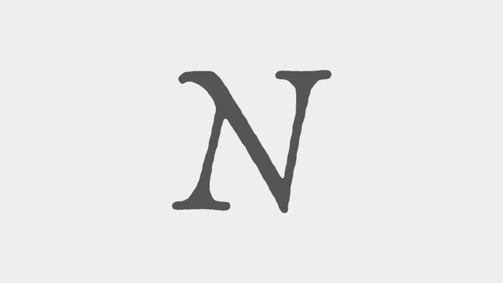
In my free time, I’ve begun to draw a new typeface from scratch. I found a single letter N in one of my old type specimen books, and I thought the idiosyncrasies of the letter would be great if I could translate them to a slightly more modern form, while still keeping the quirk of the old letter.
Here’s the inspiring N:
So the first order of business was to draw the N. This is probably a good time for a disclaimer. I’m drawing all these letters in Illustrator, and am assuming I’ll figure out how to get them into Fontographer or Glyphs later. The last typeface I drew was for Hot Wheels, and in that instance I had the wonderful dudes over at Font Bureau take care of the actual font creation, so I’m putting that into the “I’ll get to it when I get to it” bucket.
Edit: Just realized there is an article on the Glyphs blog all about Importing from Illustrator. Looks like that’s how I’ll get from here to there.
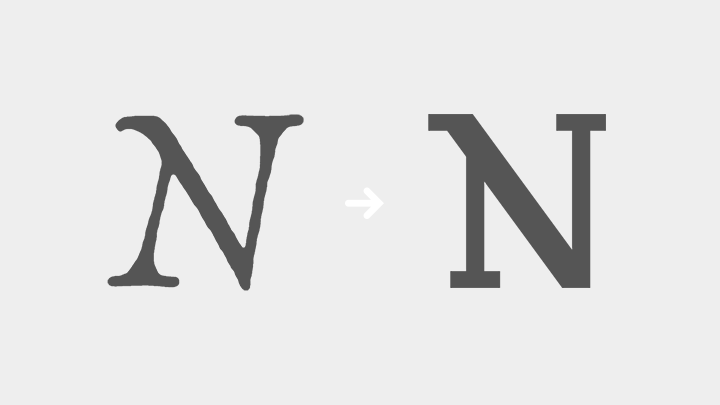
Anyhow, I had to draw this first N. I knew I didn’t want to do an italic to begin with, so I straightened things up. To make it feel more modern, I went with slab serifs and increased the contrast between the thin and thick widths. But I made sure to keep the amazing top left hook off the N. That will probably cause kerning problems later, but I wanted to keep moving.
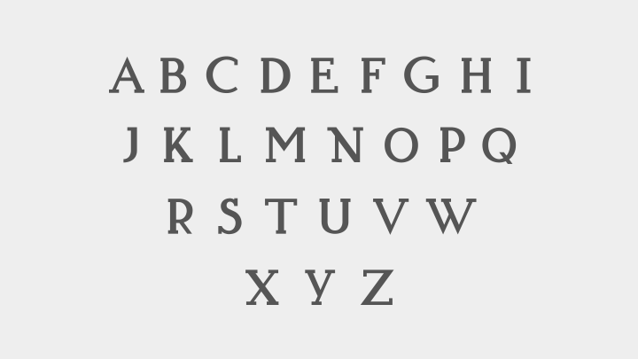
Now that I felt pretty good about that N, I went ahead and started in on some of the easier letters. I like to start with the easy ones, it gives me an early feeling of accomplishment, and helps me to define some of the systems I’ll need later for the more complicated letters.

I instantly feel in love with the M, who doesn’t love a high hangin’ M center? I sure do. The stencil like drop out of the P was something I thought might add to the overall quirk, but at the end of the day it wasn’t feeling like it belonged, and didn’t make the cut. The other letters are pretty straightforward, and helped me to define how curves will work, and some angles I can reuse - like in the K.
Another letter that took some figuring was the W. At first, there were so many lines going on in there that I thought it should have no serifs at all. I liked it, but it didn’t fit into the rest of the typeface. I tried with serifs, which felt too bulky. Finally, after looking at Ws around, I opted for the cut version. Still not sold on it - the second counter is a little too large for my liking - but it solves the problem for now.

Moving on, I drew the rest of the capital letters, and I think it’s starting to have the old world quirk I want, all wrapped up in a more modern slab serif package.
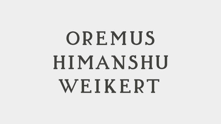
Here’s a couple tests of words, just to see how it works when I actually set it. At the moment it’s certainly a display face, and a couple of the letters make kerning difficult, but I dig where I’m headed. Let me know what you think.

